Get In Touch
& visual
Designer


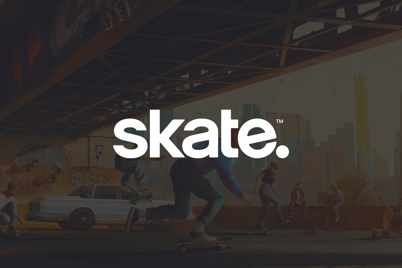
skate.
Visual and UI Design + Design System creation and management on the popular EA game skate.
Role(s)
Client
Link
View It Live
My skate. Experience
During my 2 1/2 years as a Senior UI Designer on skate. I managed our Figma design system and contributed to many features, initiatives, style guides, processes, and collaborations.
Let's drop in together.
At first, I was hired to manage and overhaul the current design system in Figma and direct how that would drive Frostbite's components, becoming the newest source of truth for our UI.
I got to work interviewing designers, developers, project managers, and producers to better understand the state of the design system and Figma union. To do this, I developed a custom Google Forms questionnaire based on disciplines, and then met with each contributor after the fact.
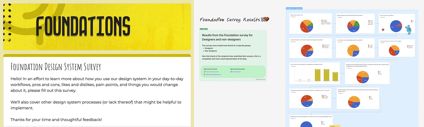
After parsing through the feedback, I categorized the data in a Figjam board and held sessions with those involved to produce action items for myself and the team.
As a direct result of the survey, I prioritized and launched a new Design System Slack channel, addressing the most frequently requested action.
The new DS channel was a hit. It started with 6-8 Design members in 2024, including only the most relevant people to not overcrowd and bog down the channel. By 2026, it grew to 49 multi-discipline members. We intentionally grew it slowly as more of the DS was being audited, refactored, and improved upon.
More channel features I set up:
- Workflow automations to triage design issues and design component additions or updates
- Resources for members to access and reference design processes, documentation, and Figma libraries
- Created a bi-monthly post series that highlighted tips and tricks for Figma and design systems to help elevate the whole team's skills
I established a regular cadence of posting updates to the Figma DS components and documentation via this channel, along with the other DS owners. This helped inform other members of the status of the system and allow them to discuss anything. The channel was inclusive and open to conversations about anything DS related, so I encouraged everyone to contribute when necessary.

Next, I moved onto the Features Team.
I helped support the other designers, while still managing the design system and simplifying the majority of the components for ease of use.
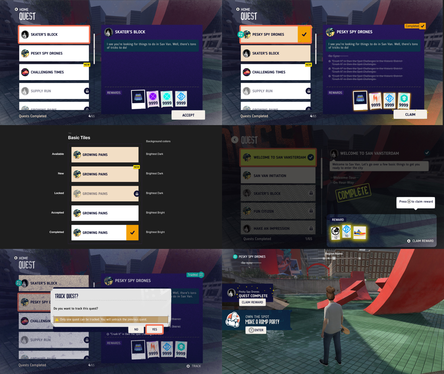
I was given a large feature right off the bat called Quests. This was both an exciting and challenging experience as it was my first opportunity to design a feature in the game with a highly trafficked player touch point. Once I got the hang of the process, I was able to confidently create, collaborate, and deliver a successful design.
A few examples of what Quests looked like for version 1:
Other UI features I designed:
- Narrative Sequencer (dialog and subtitles)
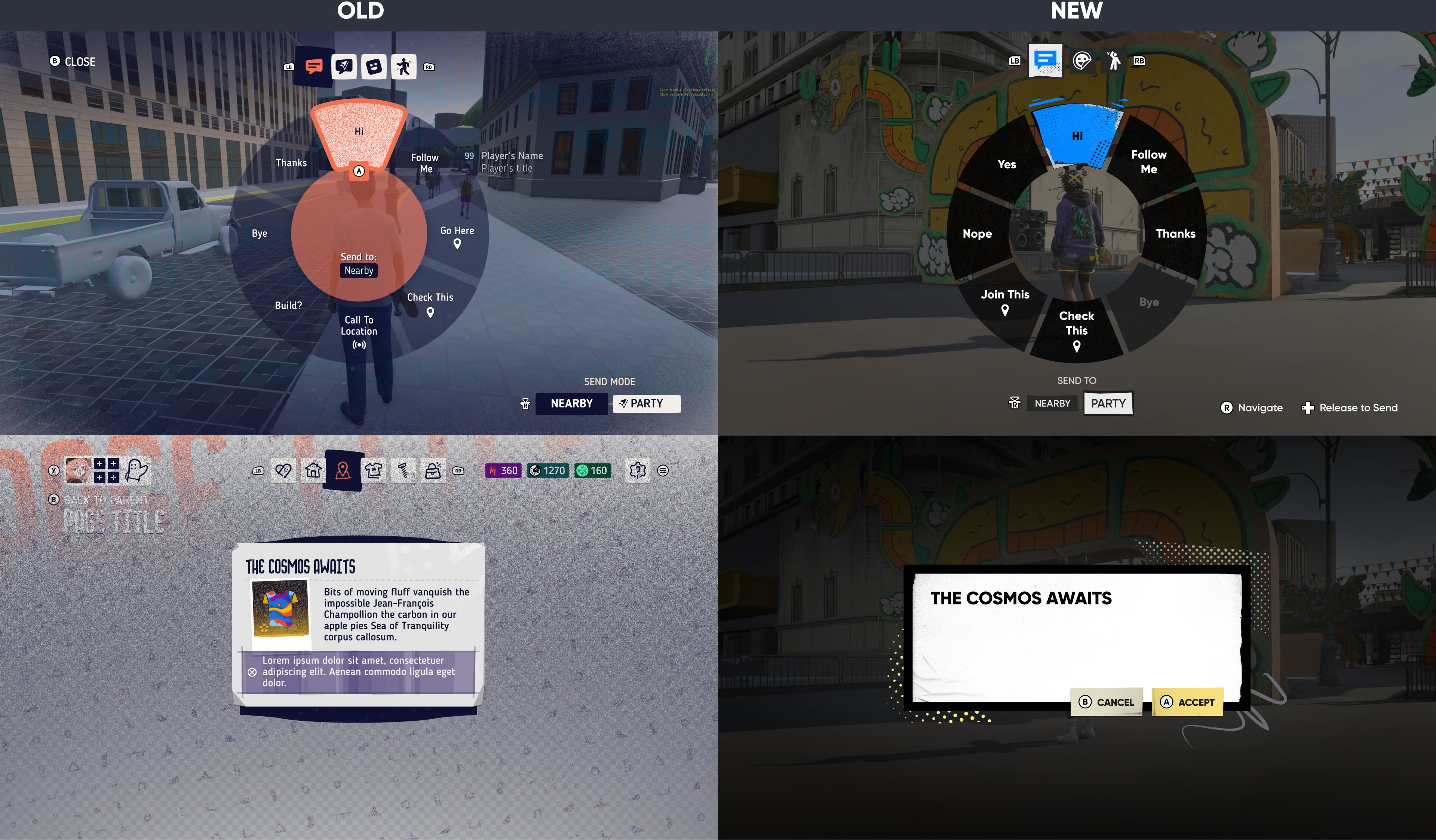
- Communication Wheel and Comms Manager
- Spectate Mode
- Onboarding Tutorials
- Challenges
- Meetups & Competitive Modes
- 3-Step Modals
- Party Voice Chat
- Social Menu(s)
- Social Feed
- Activities
- Tool Box
- HUD
- Notifications
- Player Nametags
- Code of Conduct
- Mobile Layouts
- Influencer Challenges
- Player Profile & Rip Card Customization
- Vee NPC Avatar Character
- Main Loading Banner Kickflip Animation
Social Menu, Spectate Mode, Teleport, and Music Tool Bar UI example:
Shortly after, a new UI Director was hired. I helped interview and vet candidates for the role to find an excellent fit for the position as my team's new manager. I also assisted in interviewing new candidates for other UI Designers and for UI Tech Designers.
What we lacked was a fresh and updated style guide, so we created a new one from scratch. I played a key role in shaping the style guide by using layered and textured elements, as you'll see further below.
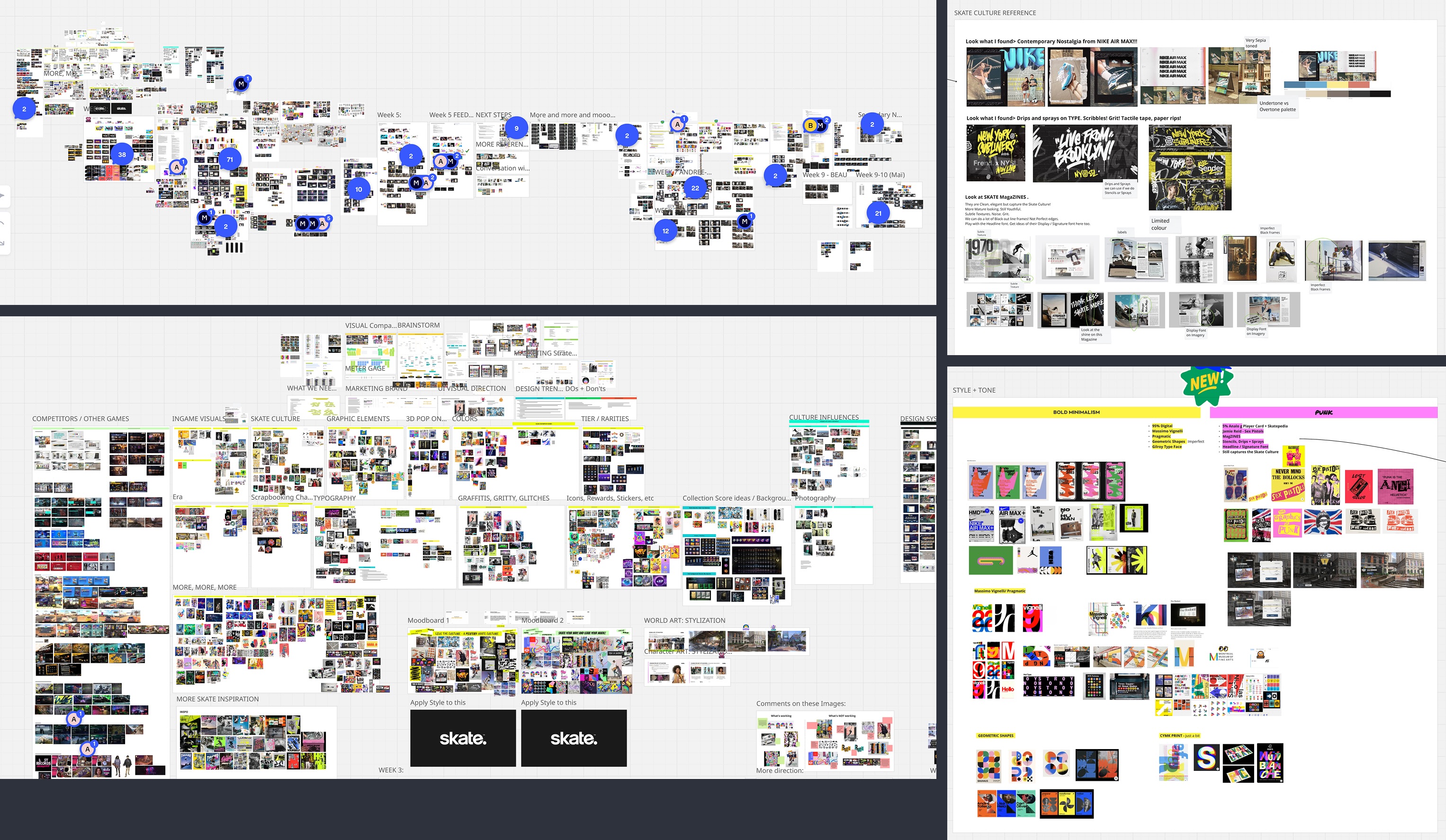
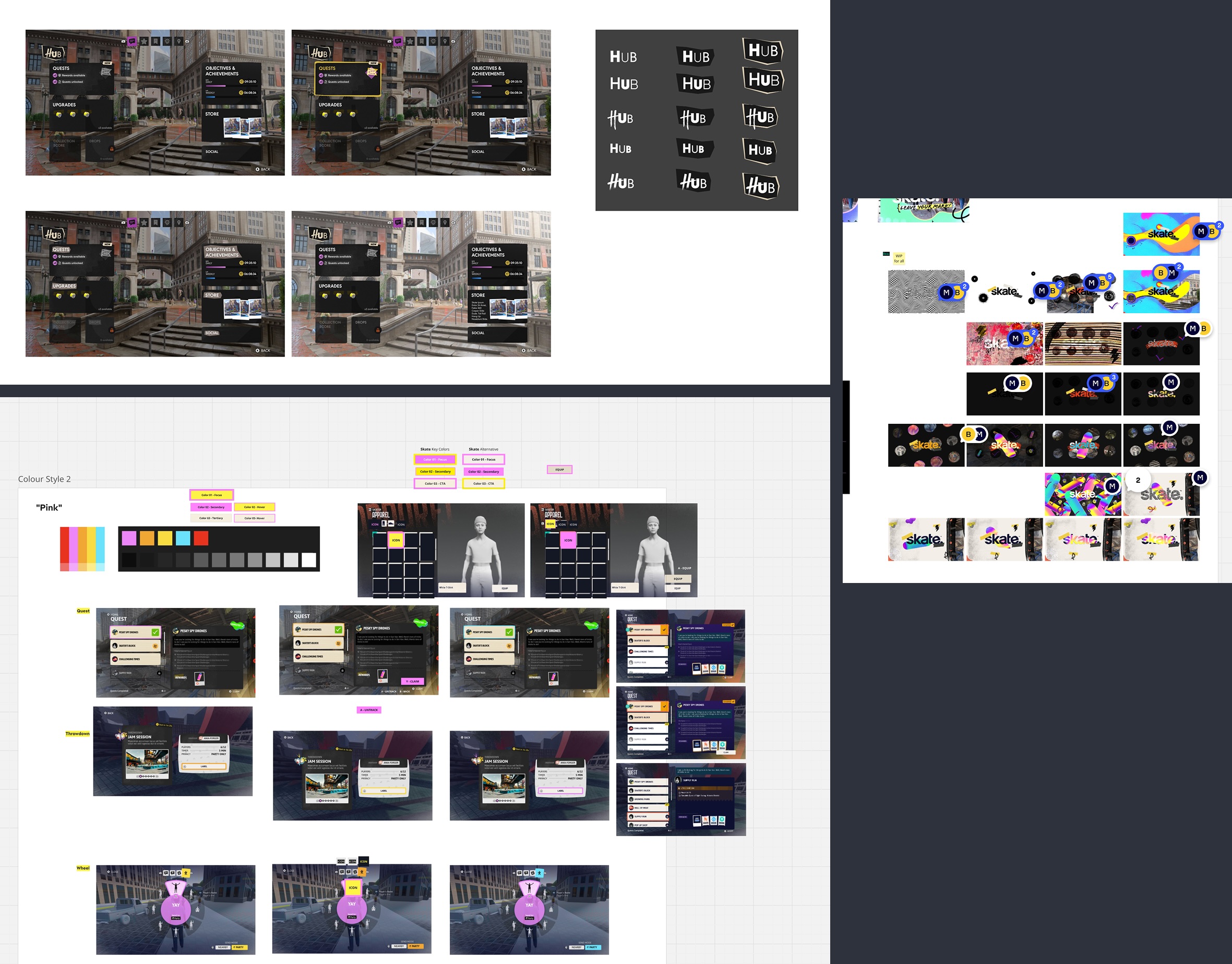
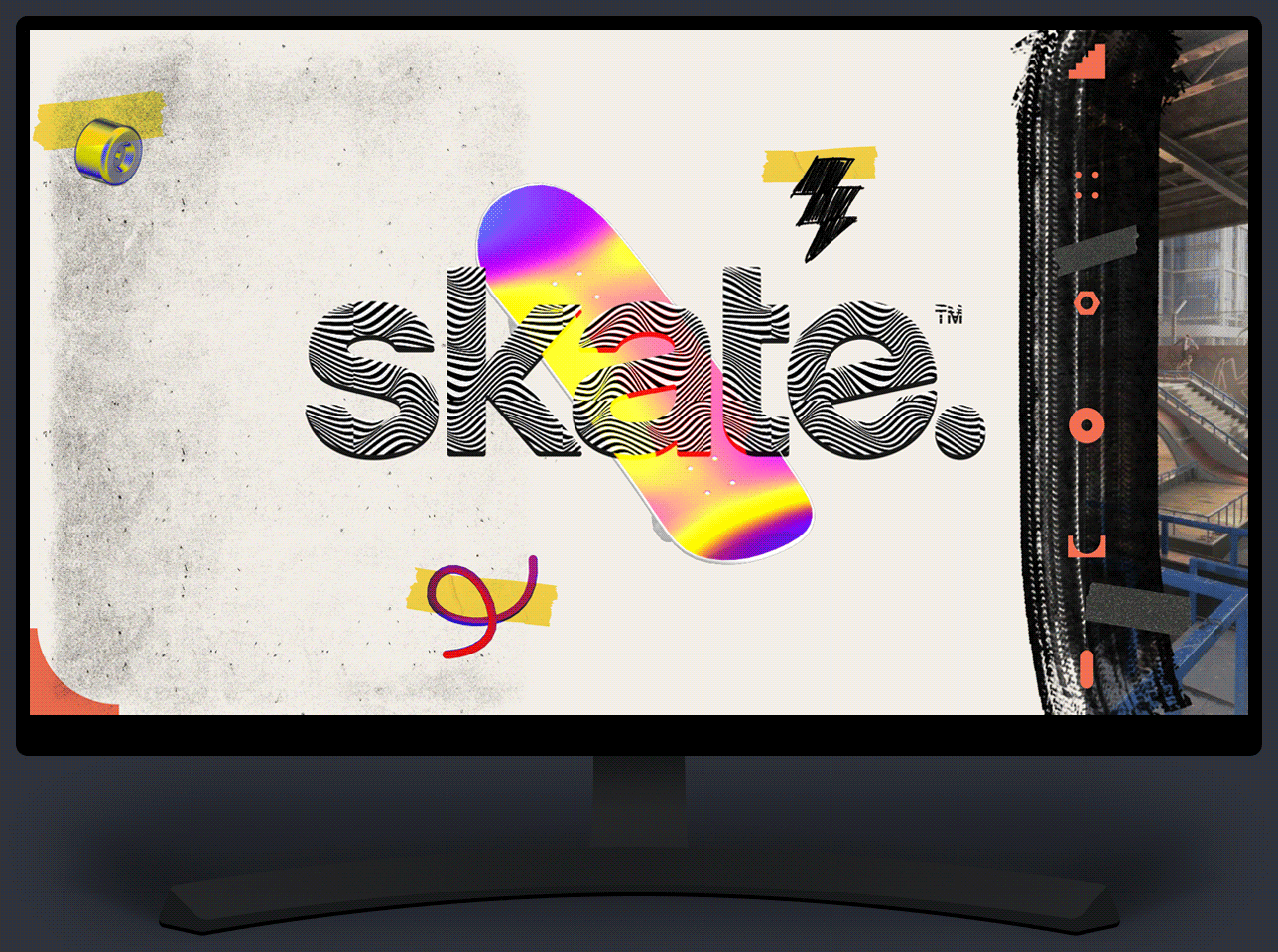
We went from a vector-based style that was flat, clean, and colorful to a more textured and tangible look and feel. After many exercises and exploratory sessions, the new style was coined "Pragmatic Punk" with a contemporary nostalgic edge.
Another exercise was to create splash screens to get a feel for how the new style guide elements would fit together.
I hand made 2D and 3D graphical elements and textures that became the basis for some of our UI, and some were shared out as Zoom backgrounds for the team.


Onto the good stuff...
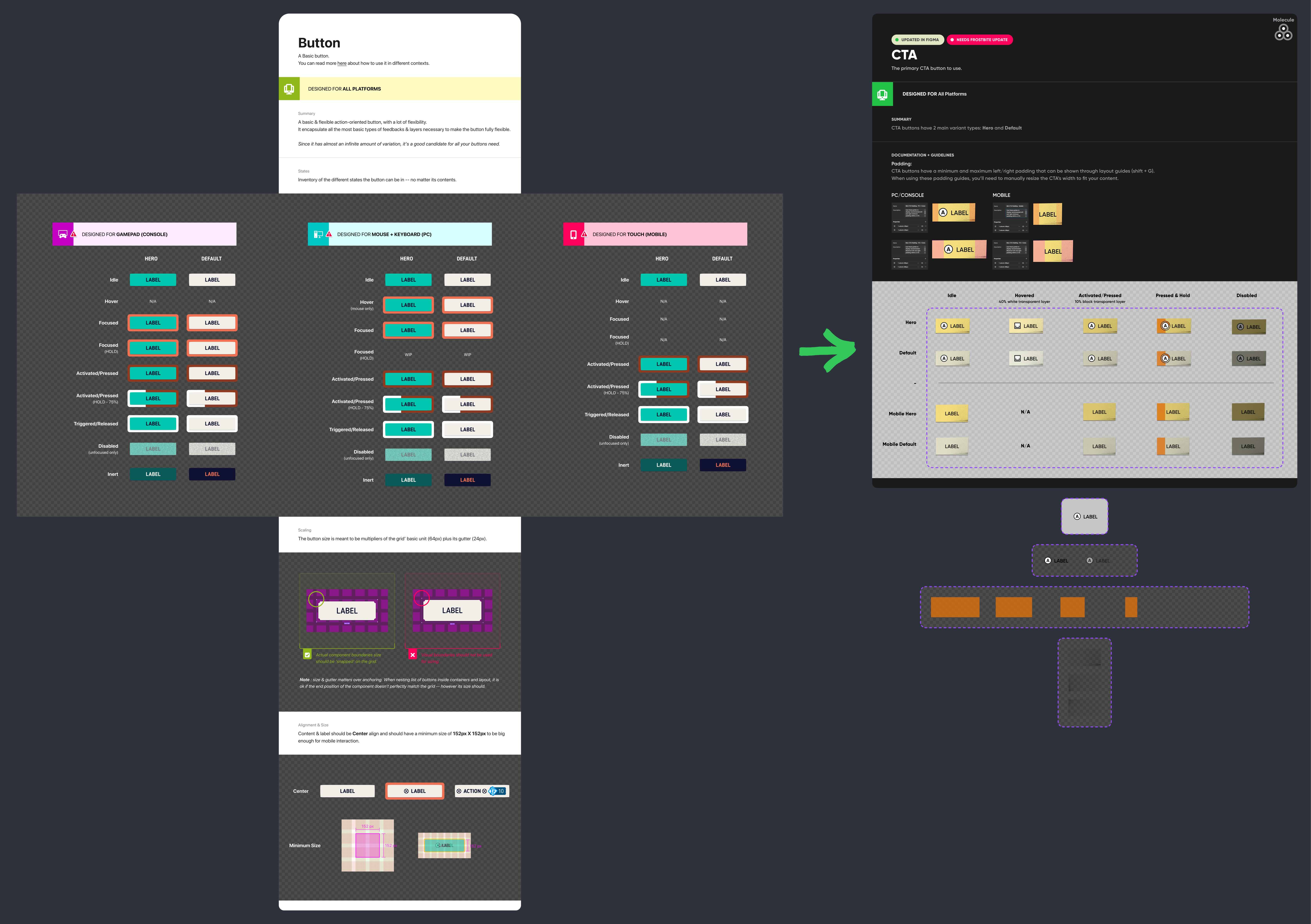
Once we had a style guide set as a UI team, I was tasked with updating, trimming, recreating, and improving all of our design system components within Figma to replace our old shared library.
Challenges I encountered and overcame.
With all products and experiences come user stories, feature briefs, specs, and requests - this was no different. I had to weigh a lot of feedback from multiple stakeholders and ensure the best approach was taken to rebuild everything in Figma.
On top of that, this became a technical challenge within Figma. We went from a vector-based design system that was condusive to scaling in Figma, but a texture-heavy DS comes with issues when you have components like a 9-slice and 3-slice for tiles and backgrounds. After much thought and iteration, I was able to figure out the best ways to approach and execute.

As leadership needed skate.'s extensive design system to be completed long before schedule, I was able to rise to the challenge and complete it in half of the initial estimated time.
Though it had to be expedited, it allowed our designers to have an updated and functional library to pull from. With the shorter timeframe, I had to get creative while problem solving how I would build the components. I was able to continuously improve upon the system as it is a living, breathing library.
It took a lot of iterating, collaborations between different user roles and teams, testing, more feedback loops, and refinement to land where I did in the end. It worked out for the best and is being used more efficiently by UX, UI, and UI Tech than previously.
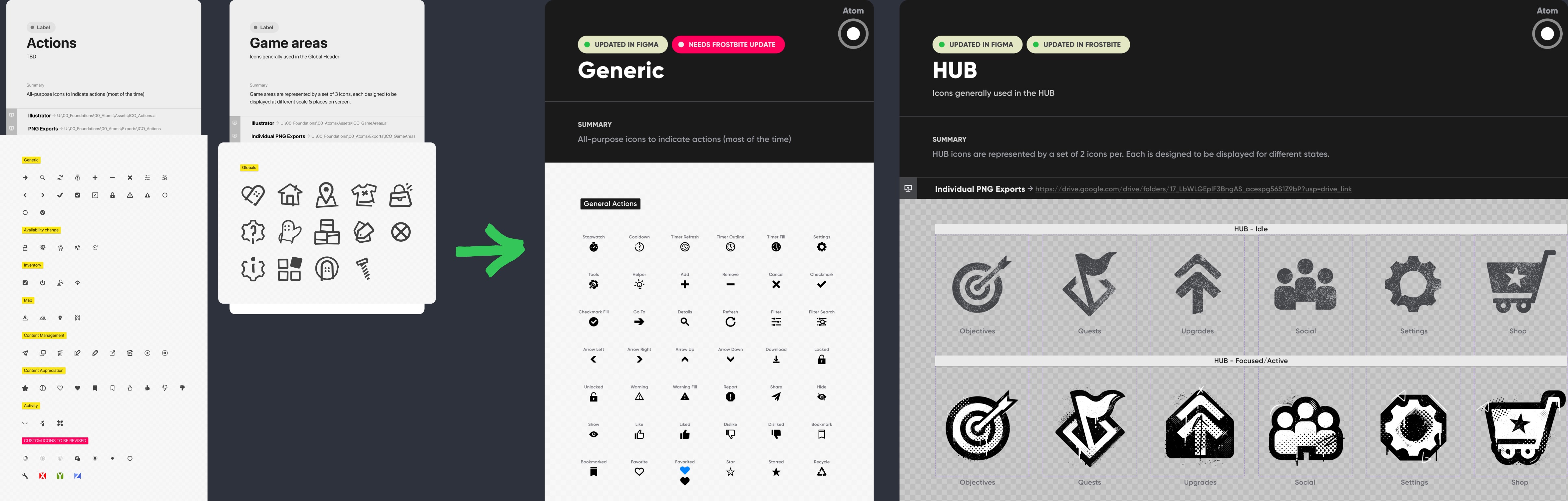
The new components shared an Atomic Design approach, but were enhanced with Figma’s auto layout feature, variables, booleans, variants, and styles for a more consistent, robust system. Previously, everything was interconnected including colors, shapes, and textures causing inconsistency. With the new "locked down" variants for each component and state, it mitigated this and now the rest of the system matches.
Above is just a small sample of the design system, which is now fully aligned with the updated styles and applied across Figma, the game engine, and the live public build wherever possible.
Below is a large feature I designed. This includes interactive prototypes for presentational purposes and for UI Tech hand off.
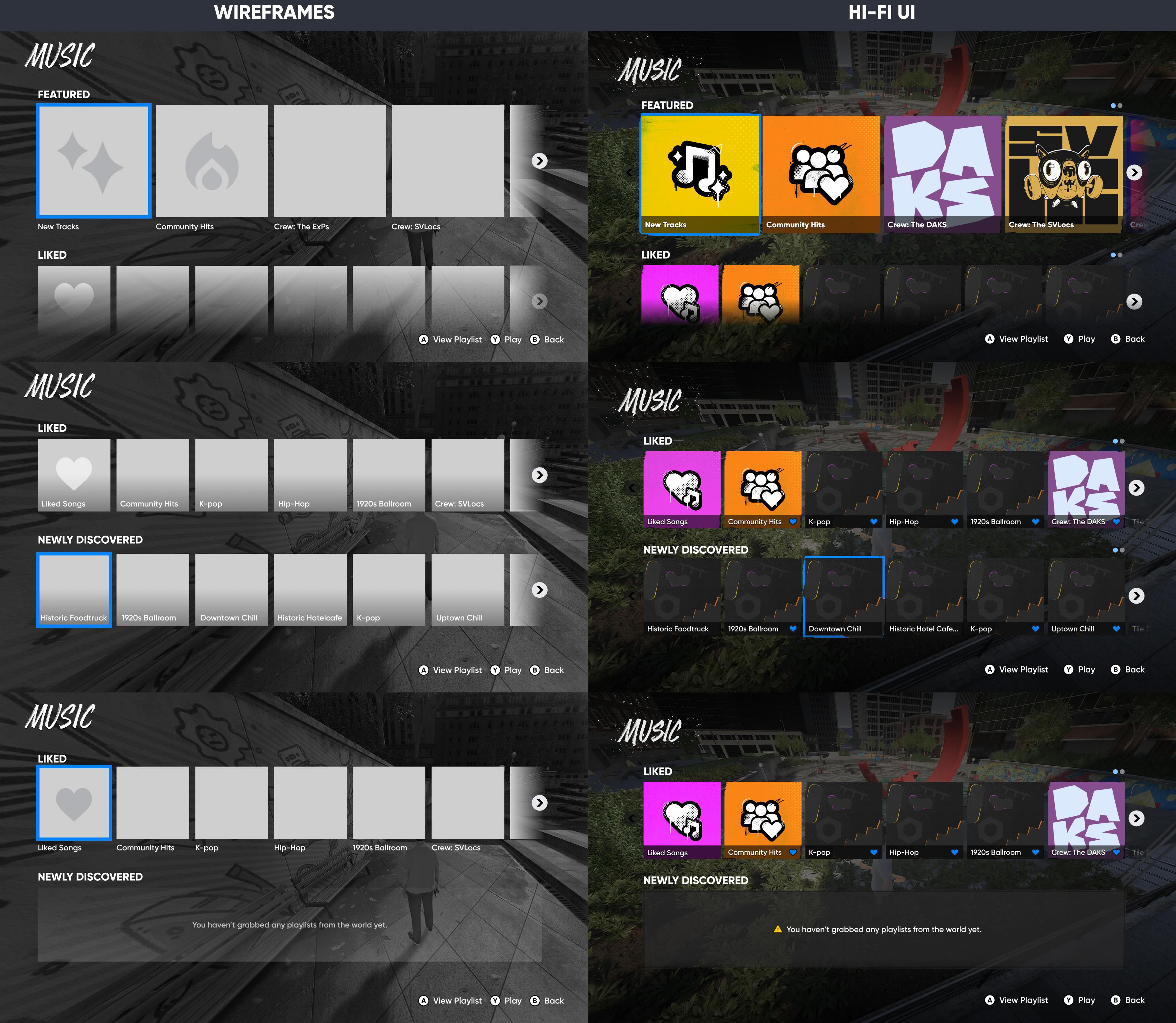
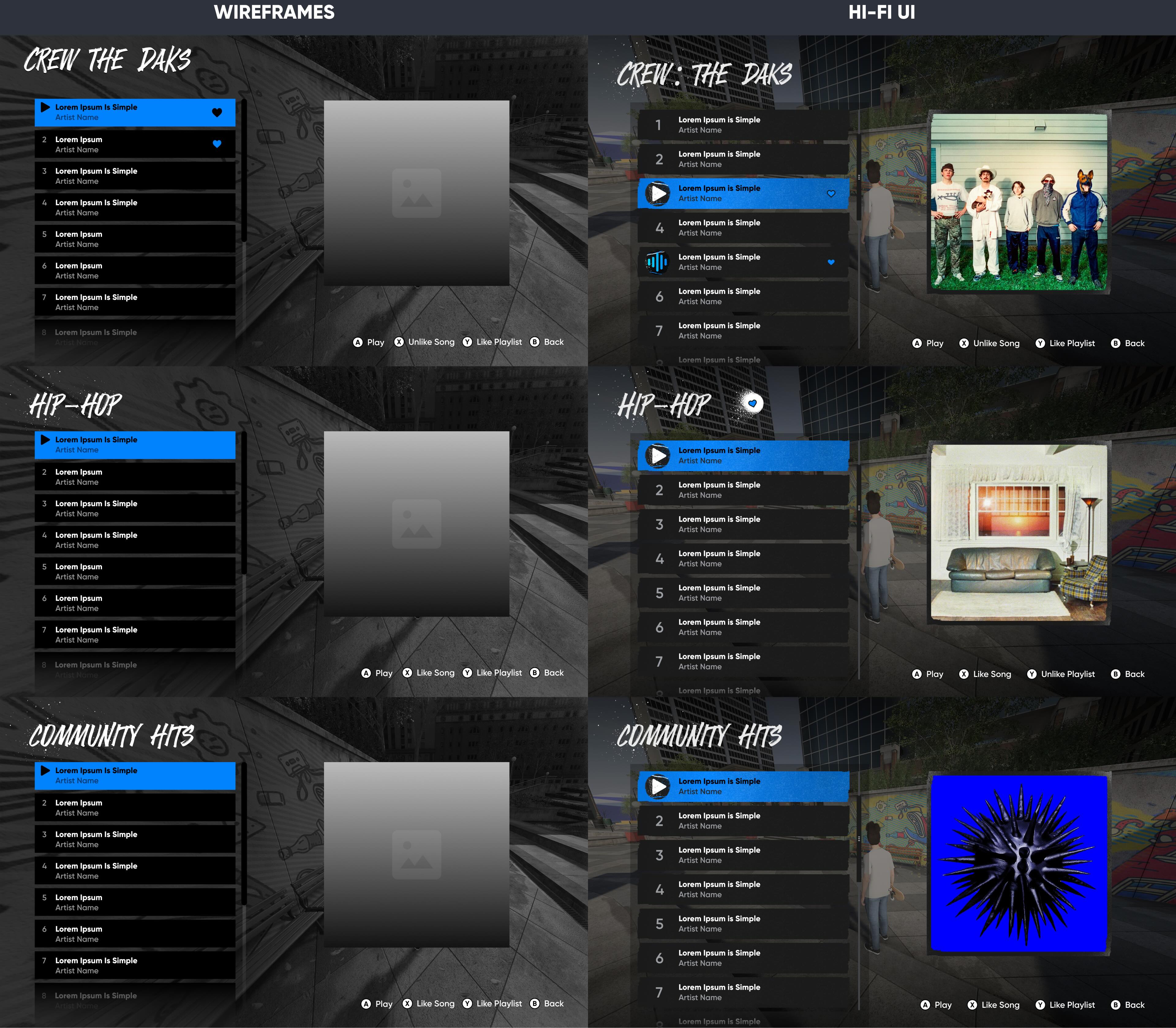
Presenting the Music Playlist Manager
This was one of my favorite features to design.
Working alongside Audio, UX, and UI Tech partners, I think it turned out to be one of the best UI-based features in the game.
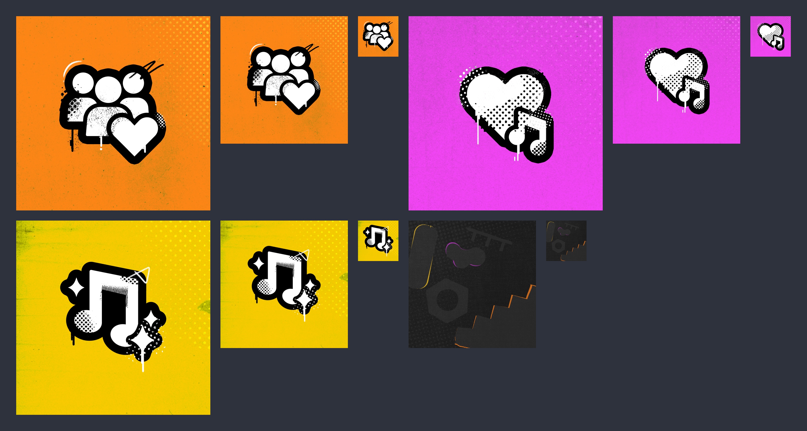
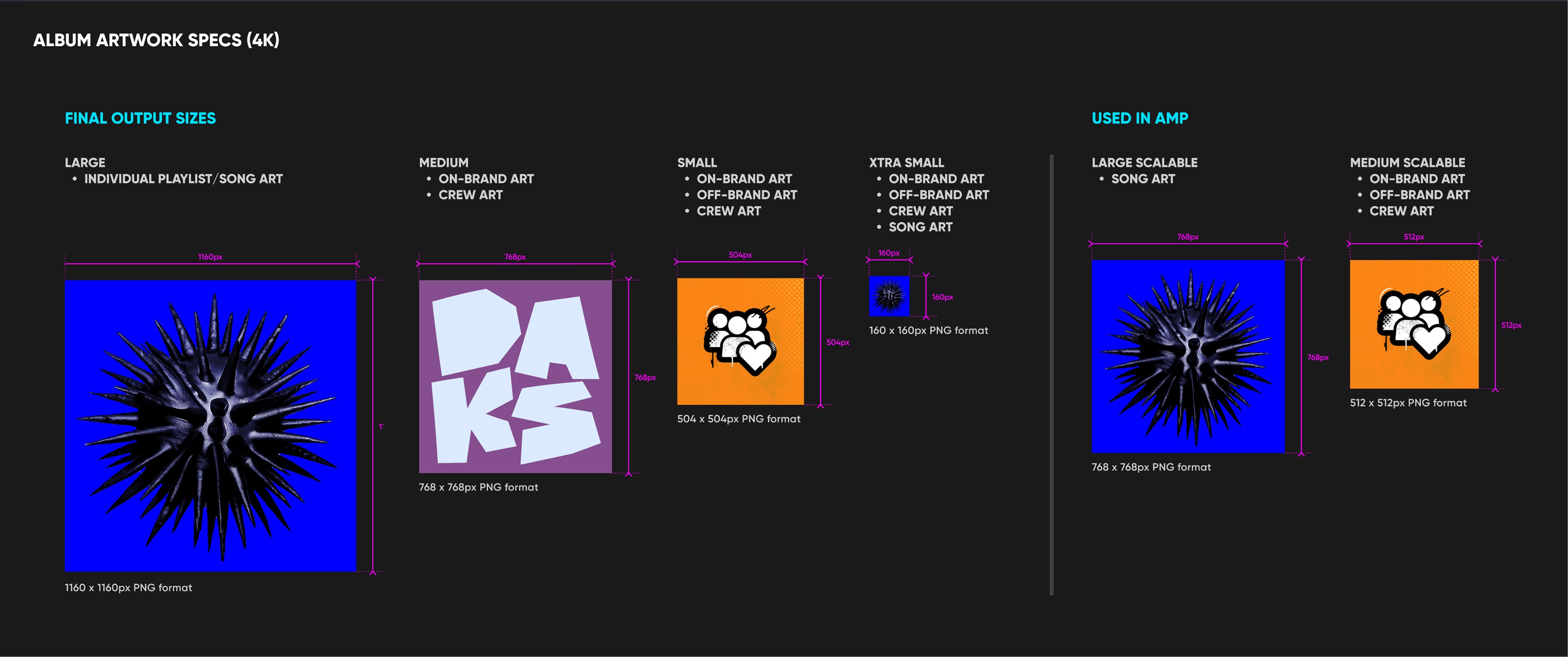
I had a hand in designing almost everything in this feature's UI, including iconography, default backgrounds for tiles, title styles, empty states, textures, and animated "now playing" playing icons. I also processed and prepared all of the album artwork for tech and created sizing guidelines for them.
Main Landing Screens:
Individual Playlist Screens:
Thanks for viewing


Let’s Get in Touch